Project Scope
A UX mentor suggested that I design something more corporate for practice purposes, and I decided on a B2B analytics dashboard. I intended to create everything from scratch: information architecture, design system, and a relatively high-fidelity UI.
All screens, components, and patterns were created specifically for this project and informed by an audit of the B2B SaaS dashboard landscape rather than any pre-existing codebase or design.
What was designed from scratch
- Information architecture & navigation model
- Full design system
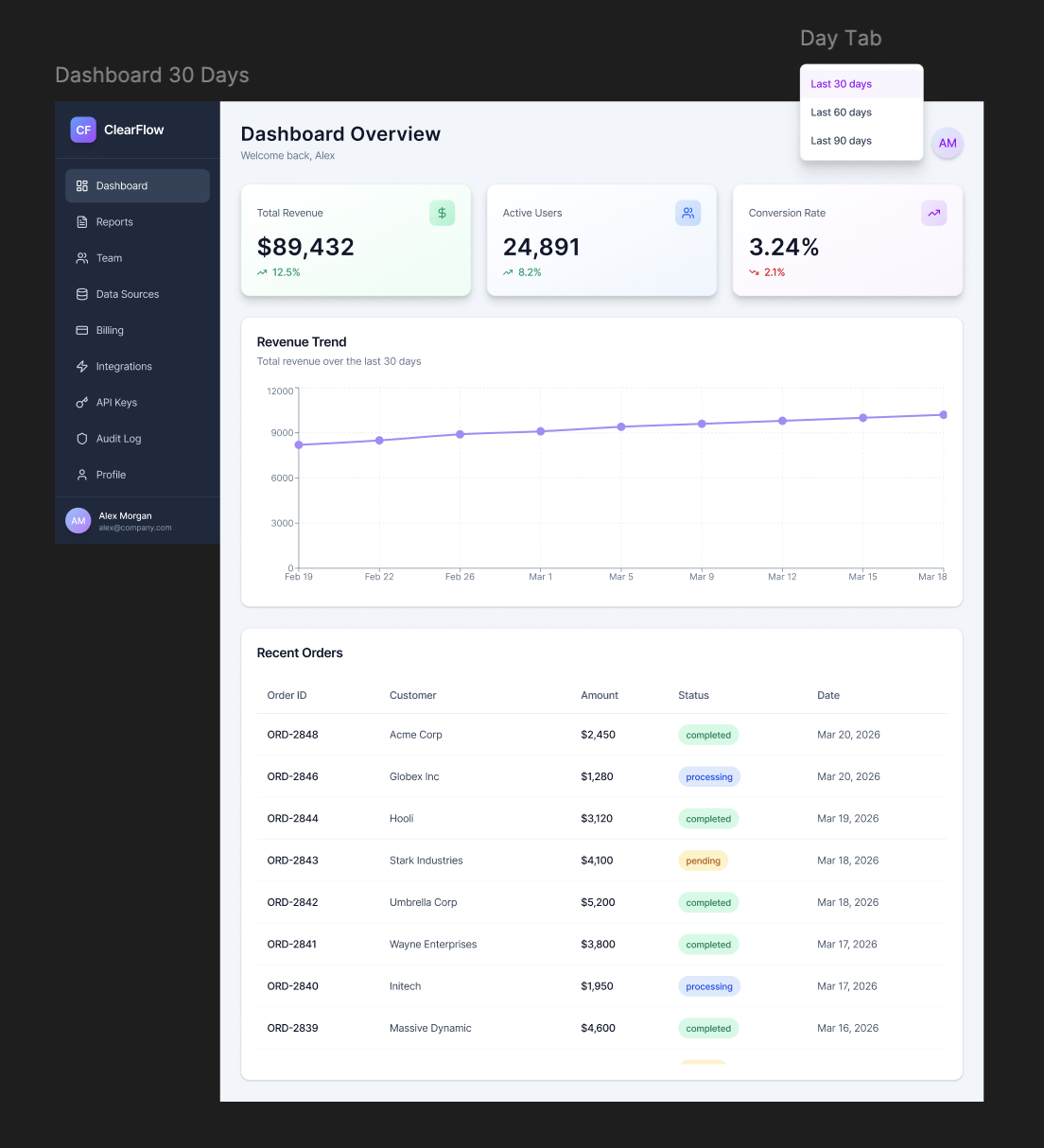
- Dashboard & data visualization UI
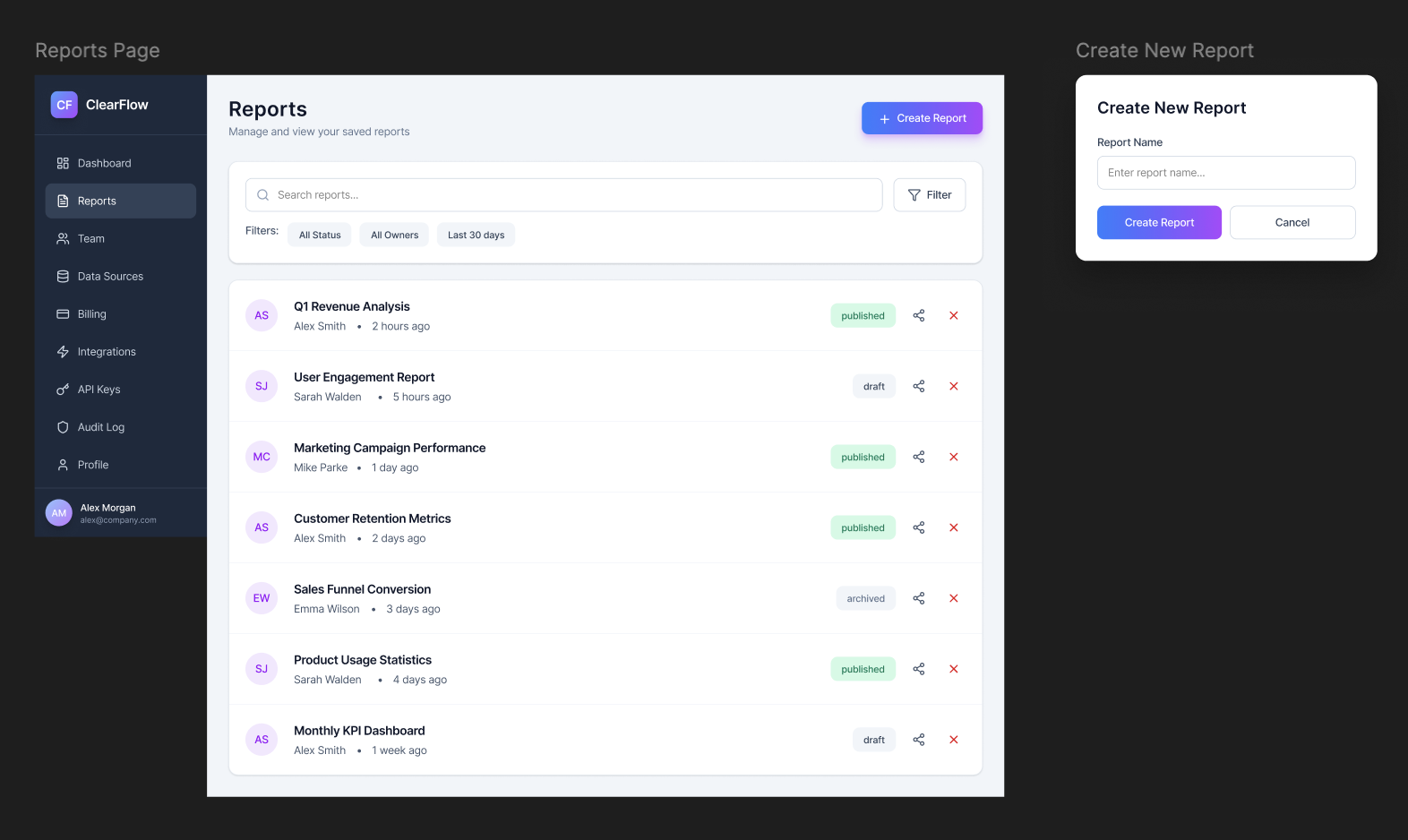
- Reports creation & management flow
- Onboarding & empty state patterns
- Integrations & API key management
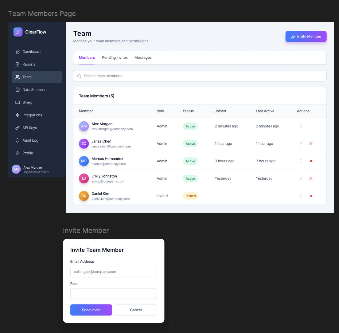
- Team & permissions management
- Audits & Billing
The Problem
Across the B2B SaaS landscape, analytics tools consistently fail users in the same ways: navigation structured around efficiency rather than how people work, unintuitive UI that confuses non-technical employees, and feature discovery so poor that some users never find half of what they're paying for.
Starting from scratch meant there was no exact model to replicate, but also no baseline to copy. The design had to be grounded in a clear understanding of where similar products succeed and fail, which made the research phase the most important aspect of this process for me.
Research & Findings
With no specific product to evaluate, research focused mostly on the competitive landscape. I did an audit of five B2B analytics platforms (Looker, Metabase, Grafana, Amplitude, Tableau), a close reading of UX literature on data-dense interfaces, and watched some walkthrough videos including product tours, onboarding recordings, and YouTube reviews where real users narrate their experience out loud.
That last source proved to be surprisingly valuable. Third-party demo videos and "honest review" content surface frustrations that polished marketing never does, like people pausing mid-flow to say "I never know how to get to this" or clicking around before completing a task. Combined with published research on B2B dashboard usability and design, I was able to identify key pain points and opportunities for improvement.
Some issues appeared consistently across different audited platforms: navigation organised around system structure rather than user ease, organization and prioritization of data in a way that makes most sense to data engineers, and complex workflows that required deep knowledge of the service. These became the three things I wanted to solve in my simple, basic design.
Design Process
Ten weeks structured in four phases. Research and design ran in parallel after week four, because new findings continuously fed back into wireframes already in progress.
The competitive audit and pattern synthesis pointed toward a consistent theme across all tools: navigation should reflect what users are trying to do, not how the system is built internally/what data engineers understand. Many existing products have been organised around the latter. The new IA was rebuilt around the former, with ten sections, each representing a distinct,clear purpose.
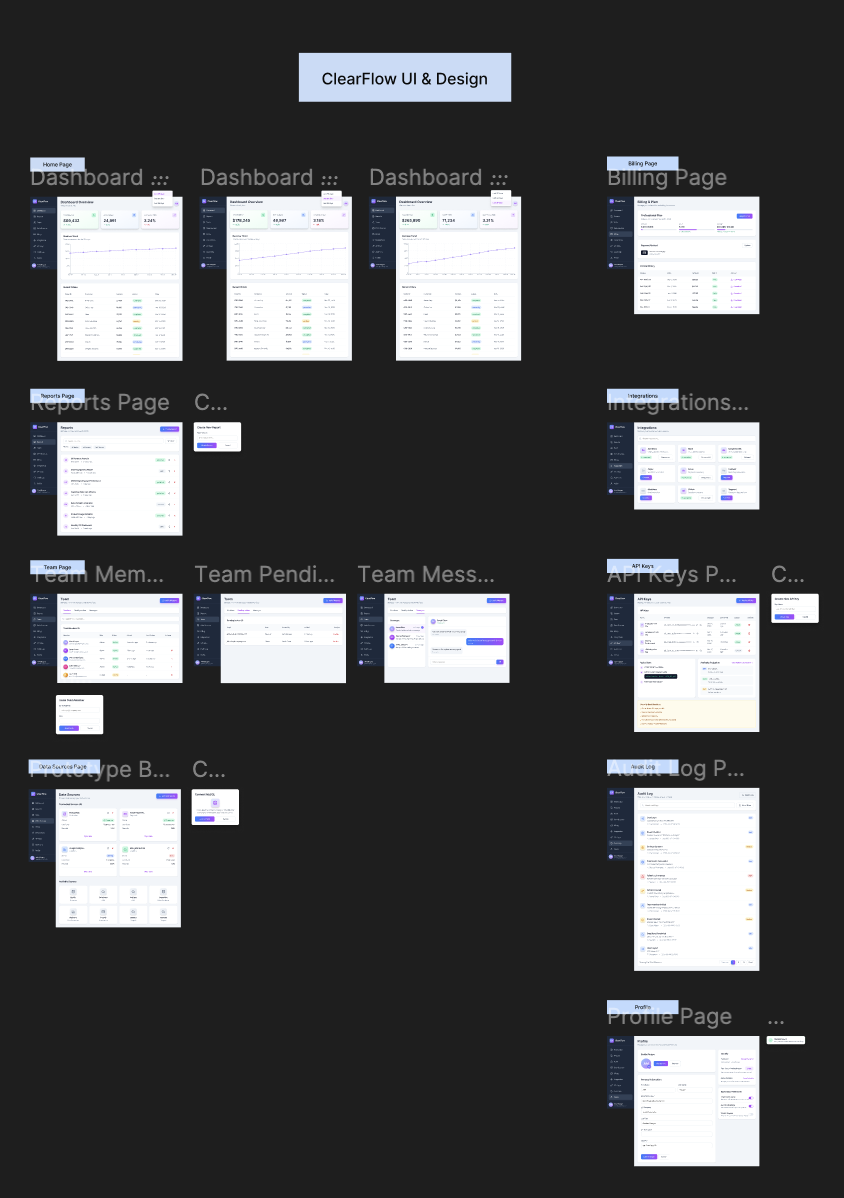
The full set of screens designed across all six navigation sections, shown here as an overview before walking through each area individually.
Design Approach
Design decisions were guided by approachable navigation (most-used tools always visible without drilling), simple, visually pleasing UI for user satisfaction, and a unified data model that made metric relationships legible without needing three separate views open simultaneously.
One of the earliest things I noticed was the complexity of some dashboards, and in particular, the lack of efficient information architecture. with the tabular choices being more streamlined, there is no nested information that is difficult to reach. For example, all "team" items are in one spot, instead of scattered in odd places, like settings.
The three highest-priority screens, dashboard overview, reports with inline filters, and team management, impacted the majority of design decisions and became the foundation for the component library.
Final Design: All Screens
The complete set of screens across all six IA sections, in navigation order.
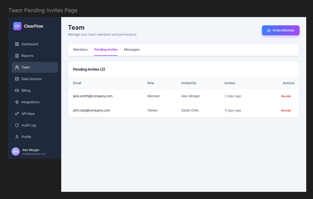
Pending invites -> status and invite people at a glance.
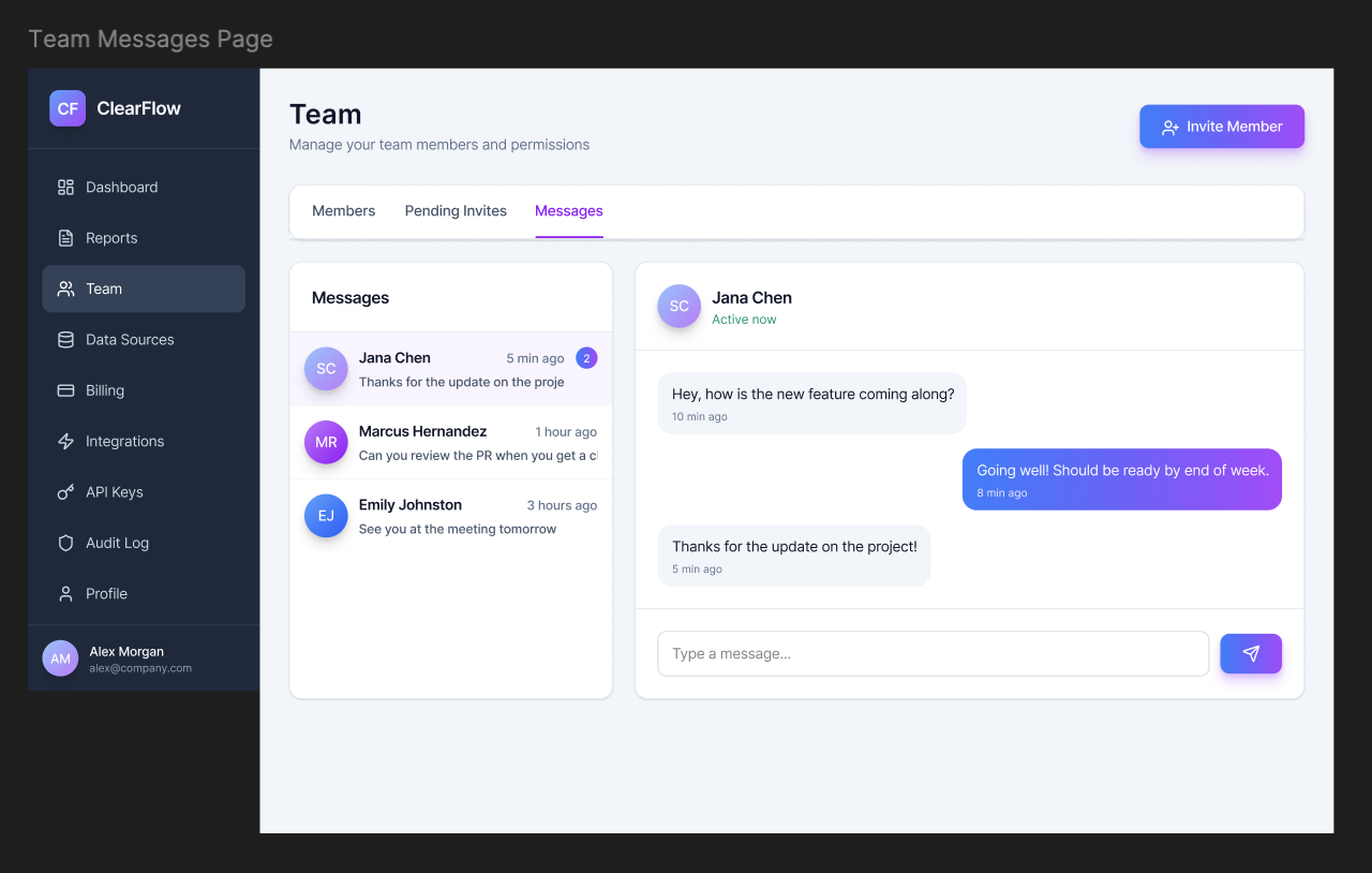
Team messages -> contextual comms within the product, no Slack tab needed
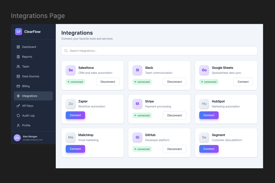
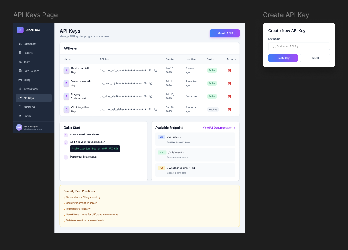
API keys -> easy access with creation date and last-used timestamp
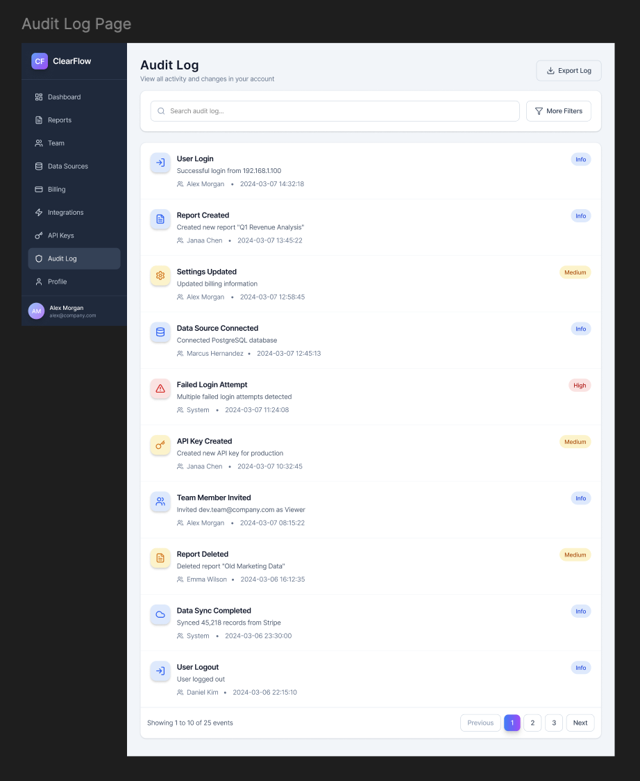
Audit log -> filterable event history with type of event, user, and timestamp
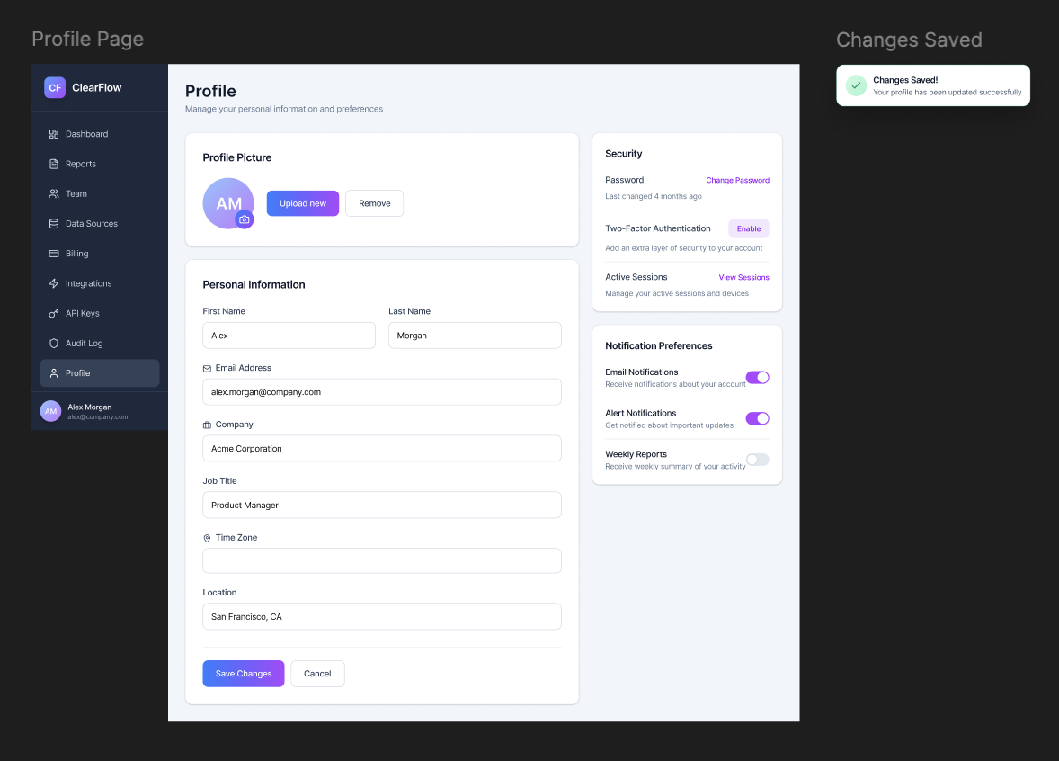
Edit profile -> personal settings, notification prefs, timezone, and display settings
Figma File
The full design system, component library, wireframes, and higher-fi screens live in Figma. If you request access to the file, it should be given in 24 hours. However, all frames should be visible in this case study.
Retrospective
Ten weeks is a compressed timeline for a platform-level redesign built entirely from scratch. Here's an honest accounting of what worked, what I'd change, and what's next.
Using This as a Template
This case study (and project) is published as a free template. If you're adapting it for your own portfolio, here's how the sections map to your project:
Template section guide
- Hero tags → swap in your own project type
- Project scope → describe what you built and its constraints
- Research section → replace with your own stats
- Timeline → adjust phases and week counts
- IA diagram → add an IA diagram (I chose not to, but it's good practice)
- Before/After → document your key workflow wins
- Wireframe slots → drop in your own images
- Figma link → swap in your file URL
- Outcomes → This was a short project with no clear outcome metrics, so I didn't add any. However, you should include any relevant metrics or KPIs that demonstrate the impact of your work.
- Retrospective → be honest, it's the easiest section to write!